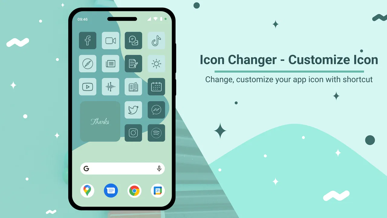
Icon Changer - Customize Icon
- 4.6
- Rating
- 1.00M
- Installs
- Free
- Price

 Analysis by App-foxy
I like personalization apps that solve one small problem without trying to take over the whole phone. Icon Changer, developed by ambi mx, follows that approach: it focuses on replacing app icons with custom artwork so the home screen feels more personal. I tested it with the mindset of someone who wants a cleaner theme, a more recognizable layout, or simply a way to make a familiar device look less ordinary.
The app is free to use, with optional in-app purchases priced at $3.99 per item. It belongs to the personalization category, is suitable for Everyone, and works on devices running Android 7.0 or later. Its current version is 1.4.1, and it has built a sizeable audience, with over a million installs and an average rating of 4.6 from around twenty-three thousand ratings. Those figures do not replace hands-on testing, but they do suggest that the basic idea is easy for many people to understand.
How the customization experience feels in everyday use
The central workflow is straightforward. I choose an app, select a custom image for its icon, and adjust the result until it fits the rest of my home screen. That makes the app useful for themed layouts, color-based organization, seasonal designs, or a minimalist arrangement where every shortcut follows the same visual style.
You May Also Like

 Blood Strike: 2.5 Anniversary
Blood Strike’s Loadouts Turn Every Drop Into a Tactical Gamble
A close look at Blood Strike’s custom loadouts: how fast access to signature weapons reshapes its battle royale rhythm, rewards preparation, and narrows the gap between fights.

 Pandora - Music & Podcasts
Pandora’s Music Is Easy to Start, but Harder to Recover
Pandora’s strength is its low-effort path from a seed to a station. Its weak spot is how much confidence it asks you to place in connection, setup, and quiet recovery.

 8 Ball Pool
 Is Built on Rivalries, Rematches, and Routine
A close look at the rivalries, rematches, shared routines, and unanswered safety questions that turn a quick pool match into a persistent mobile community.

 Samsung Music
’s Quiet Strength Is Playing What You Already Own
Its reach comes less from spectacle than from dependable access to a personal library. That simplicity is both the app’s strongest retention engine and its ceiling.

 AccuWeather: Weather Radar
AccuWeather Review: A Quick, Clear Forecast for Everyday Decisions
For everyday plans, the best forecast is the one you can understand quickly. AccuWeather makes rain timing, radar, and local conditions easy to act on, with a few trade-offs.

 Hill Climb Racing
Why Hill Climb Racing Still Turns Crashes Into One More Run
A tiny car, a bumpy hill and one more upgrade: Hill Climb Racing keeps resurfacing because its simple chaos makes every near-miss feel personal.
More From Our News Desk



What I appreciate most is that the value is immediately visible. There is no long learning curve before seeing a result. If I want a row of matching icons for communication apps, a softer visual style for a child-friendly tablet, or a more muted appearance for a work setup, the purpose is clear from the first use.
That simplicity also defines the app’s limits. This is not a full launcher replacement, a widget suite, or a complete home-screen management system. It is better understood as a focused icon-customization tool. If you want extensive gesture controls, automatic theme switching, advanced drawer settings, or a complete visual redesign of Android, you will probably need a launcher or a broader theming solution instead.
For many users, that narrower scope is actually an advantage. A launcher can change the way the entire phone behaves, and that often means spending time learning a new interface. Icon Changer is more suitable when I want to keep my familiar launcher and change only the appearance of selected shortcuts.
A realistic morning-to-evening use case
Imagine setting up a phone for a new job. I might use one visual style for work tools, another for personal communication, and a third for finance-related apps. Rather than moving everything into a new launcher, I can customize the icons that matter most and leave the rest untouched. The result is not just decorative: the home screen becomes easier to scan because the visual groups have a purpose.
Another practical example is a shared family tablet. A parent could create friendlier-looking shortcuts for frequently used apps, while keeping the underlying applications unchanged. That distinction matters. The icon is being personalized, not the app’s actual function, so I would still explain to a child what each shortcut opens rather than relying only on the artwork.
I also found the tool more useful when I planned the design before changing anything. Picking a small palette first prevents the home screen from becoming a collection of unrelated images. A few consistent colors usually look more polished than replacing every icon with a different style.
What to prepare before changing icons
The best results depend heavily on the images I choose. A square image with a clear subject tends to work better than a busy photograph. Small details can disappear when the icon is reduced, so simple symbols, strong contrast, and uncluttered backgrounds are safer choices.
I recommend creating a small folder of candidate images before starting. That makes it easier to compare a consistent set instead of selecting icons one at a time with no overall plan. It also reduces the temptation to use attractive images that look good individually but clash when placed beside one another.
There is a useful trade-off between personality and recognition. A highly artistic icon may fit a theme beautifully, but it can make the app harder to identify at a glance. For apps I open several times a day, I prefer keeping a recognizable color or symbol. For less frequently used apps, I have more freedom to prioritize appearance.
Another detail worth considering is the phone’s existing wallpaper. A custom icon that looks balanced against a plain background may become difficult to read over a detailed image. I would test the most important shortcuts first, then decide whether the wallpaper needs simplifying rather than endlessly adjusting every icon.
Trust starts with visible choices
Because this kind of app works with images and the visual organization of a device, I pay attention to every screen that asks me to choose something. The important question is not only whether customization works, but whether I understand what I am selecting and why.
My preferred setup process is one where the chosen app, image, and resulting shortcut are obvious before I confirm. That gives me a chance to catch mistakes, especially when several icons have similar names. A clear preview is valuable here because it turns an invisible change into something I can inspect before committing it.
I also treat optional purchases carefully. The app is free, but individual in-app items cost $3.99. I would not assume that every customization choice is included without checking the purchase prompt. Reading the wording around an item before confirming is a sensible habit, particularly if someone else uses the device or if purchases are protected by a shared account.
The age classification is Everyone, which makes the app approachable for a broad audience. Still, an age label does not remove the need for ordinary account and device supervision. If a child is customizing a family phone, I would handle purchase approval and account settings separately rather than treating the rating as a guarantee about every possible image a user might select.
Data-sensitive moments deserve attention
The most data-sensitive part of using a custom icon tool is often the image-selection step. Personal photos can contain faces, addresses, school uniforms, documents, or other details that I would not want to use casually. I prefer choosing artwork, symbols, or cropped images that communicate the theme without exposing private information.
This is especially important when customizing icons for messaging, banking, health, or work applications. An image that seems harmless in a private gallery can become visible on a lock screen or in a screenshot. I would avoid using confidential documents or identifiable photographs as icon artwork, even if the image is only intended for personal use.
I also separate the question of app trust from the question of image privacy. A user can make a careful choice about the app and still select an unnecessarily sensitive picture. My practical rule is simple: use the least revealing image that still gives the shortcut the look I want.
Before granting any device access requested during setup, I would read the system prompt and make sure it matches the action I am trying to perform. Android’s permission screens are the right place to make that decision. If a request feels unrelated to changing an icon, I would pause rather than approve it automatically.
That cautious approach is not a criticism of ambi mx by itself; it is a sensible habit for any personalization utility. The app’s job is narrow, so I expect the visible controls and requests to remain easy to understand. When I see a prompt, I want to know whether it is needed for selecting an image, completing a shortcut, or using a paid option.
Keeping control after the first setup
One question many people have is whether customizing an icon changes the original application. In practical terms, I treat the process as a home-screen appearance change rather than a modification of the app’s internal interface. The original application remains the thing being opened; the customized shortcut is simply the visual entry point I chose.
That distinction affects how I organize the phone. I would keep the original app location in mind, especially if I remove or rearrange shortcuts. A custom home-screen design can look excellent while still creating confusion if the same app appears in multiple places with different artwork.
For that reason, I prefer changing a few high-priority icons first. After using the layout for a day, I can see whether the images are easy to recognize and whether the arrangement is actually faster. Only then would I continue with less important apps. This staged approach saves time and avoids having to undo a complete redesign.
It is also worth remembering that a visual shortcut is not the same as a system-level identity. Notifications, search results, app settings, and other parts of Android may continue to show the original app’s standard name or icon. If you expect every part of the operating system to adopt the custom artwork, this focused tool may feel incomplete.
That is where a launcher or manufacturer theme system can be a better fit. Those alternatives may offer deeper integration, but they also tend to affect more of the phone. I would choose Icon Changer when selective control matters more than a fully unified system appearance.
Where it fits among the usual alternatives
The usual alternatives fall into three groups: built-in phone theming tools, custom launchers, and manually prepared shortcuts. Built-in options can be convenient when they support the exact icon pack or style I want, but they may be limited by the phone manufacturer. A launcher can go much further, yet it changes navigation and often requires more setup.
Manual shortcut methods may avoid installing a dedicated personalization app, but they can be less comfortable for someone who wants a guided workflow. They also make it easier to lose track of which image belongs to which application. Icon Changer’s appeal is the middle ground: more direct than building everything manually, but less disruptive than replacing the launcher.
The trade-off is that a focused icon tool may not provide the same level of automation as a full theme engine. If I want every supported application to update at once, I would first check whether the available workflow matches that expectation. For a small, carefully selected set of icons, the narrower approach is not a serious problem. For a large library, repeated manual choices could become tedious.
I would also compare the result with the phone’s default icon shapes. Some devices apply masks, spacing, or labels in ways that affect the final appearance. A custom image that looks perfect during selection may feel less balanced once it sits among the manufacturer’s icons. Testing one or two examples before committing to a complete theme is the most efficient way to avoid disappointment.
Useful habits for a cleaner result
My first tip is to design around recognition rather than decoration alone. Keep a shared background color for apps in the same group, but preserve a distinctive symbol for each one. This creates visual order without turning the home screen into a puzzle.
My second tip is to make a backup plan for the artwork. If an image is stored in a temporary location or later deleted, the appearance may not remain exactly as expected. I would keep the final icon images in a dedicated folder and avoid moving them until the layout has been used for a while.
My third tip is to customize the first screen more carefully than secondary pages. The first screen is where visual clutter has the greatest effect on daily use. A handful of consistent icons can make a bigger difference than changing every application on the phone.
My fourth tip is to take a screenshot of the finished arrangement. That gives me a reference if I change launchers, reset the home screen, or need to recreate the layout later. It is a simple way to preserve the design without assuming that every device change will keep it intact.
Finally, I would review paid choices with the same care as any digital purchase. Since optional items are charged individually at $3.99, I would decide whether a particular addition improves the overall theme before buying it. A consistent free design is often more satisfying than collecting isolated premium elements that do not work together.
Who should use it, and who should skip it
I think Icon Changer is a good match for someone who wants a personal home screen without learning a new launcher. It suits users who enjoy visual organization, people preparing a themed device, and anyone who wants to update a few important shortcuts rather than rebuild the entire interface.
It can also work well for a temporary design project. For example, I might create a coordinated layout for a trip, a school term, or a new work routine, then return to a simpler arrangement later. The focused nature of the app makes that kind of experiment less intimidating than adopting a complete launcher.
I would skip it if my priority is deep system-wide theming. Users who want custom gestures, extensive drawer controls, automatic icon replacement across a large app collection, or a completely different navigation experience should look at a launcher or a more comprehensive theme solution.
I would also skip it if I am unwilling to spend time choosing and organizing artwork. The app makes customization accessible, but it cannot decide whether my images match, remain readable, or fit the wallpaper. The quality of the final result depends on those choices, so anyone seeking a one-tap transformation may find the process more involved than expected.
My cautious verdict after using it
Icon Changer succeeds because it stays focused. It gives me a practical way to personalize selected app shortcuts while leaving the rest of my familiar Android setup in place. I like that balance: the result can feel fresh without forcing me to relearn how the phone works.
At the same time, I would approach it with realistic expectations. It is not a complete launcher, and custom artwork does not automatically improve usability. The strongest results come from a small, consistent set of icons, careful image selection, and attention to what each confirmation or purchase screen is asking me to do.
With a free entry point, Everyone content rating, support for Android 7.0 and later, and a current version of 1.4.1, it is easy to try for a modest personalization project. The optional $3.99 items mean I would keep an eye on individual purchases rather than assuming every visual option is included.
My recommendation is cautious but positive: try it if you want selective icon changes and value control over a familiar home screen. Keep personal images conservative, inspect device prompts before accepting them, and test the layout with a few shortcuts first. If that matches your goal, Icon Changer is a sensible, approachable tool from ambi mx. If you want the entire phone redesigned, a full launcher will likely give you more power for the extra complexity.
FAQs for Icon Changer - Customize Icon
01What is Icon Changer - Customize Icon used for?
Icon Changer - Customize Icon is designed to personalize the appearance of app icons on your mobile device. It allows you to replace standard icons with images, photos, or themed artwork and can help create a more coordinated home screen. It is mainly a visual customization tool, so it does not change how the original apps work or add new features to them.
02Does Icon Changer - Customize Icon change the original app icons permanently?
In most cases, the app creates a customized shortcut on the home screen rather than modifying the original icon inside the installed application. The original app remains installed and can usually still be accessed from the app drawer or device settings. Depending on your Android version and launcher, the customized shortcut may display a small shortcut badge or behave slightly differently from a standard icon.
03Can I use my own photos or images for customized icons?
The app generally supports selecting images from your device or using available icon artwork, allowing you to create a more personal home-screen layout. You may need to grant access to photos or files before choosing an image. For the best result, use square, clear images with good contrast, because very detailed or poorly cropped pictures may look unclear when reduced to icon size.
04Is Icon Changer - Customize Icon free to download and use?
The application may be available to download at no initial cost, but some customization tools, icon packs, templates, or an ad-free experience can depend on the version and in-app purchase options. Before confirming a purchase, check the store listing for current pricing, subscriptions, and trial conditions. Availability of specific features may also vary by device and region.
05Does Icon Changer - Customize Icon work on every Android phone?
Compatibility can vary according to your Android version, device manufacturer, and home-screen launcher. The basic shortcut-creation process usually works on many Android phones, but icon badges, shortcut behavior, and visual placement may differ. If changes do not appear immediately, try refreshing the launcher or reopening the home screen. It is also wise to review requested permissions before installation.
Pros
- Simple interface makes changing app icons quick and beginner-friendly.
- Supports personal images
- letting you create a more individual home screen.
- Useful for matching icons to wallpapers
- themes
- or seasonal designs.
- Can help organize apps visually with coordinated custom icon sets.
- Offers a convenient way to refresh your phone’s appearance without a launcher.
Cons
- Custom shortcuts may open through an intermediate screen on some devices.
- Some icon packs or customization options may require in-app purchases.
- Results and available features can vary between Android versions and phone brands.
- Creating many custom icons can take time compared with using a complete icon pack.
- The app may need access to photos or storage when importing personal images.

Icon Changer - Customize Icon
Gallery